Financial Services PR: Firms Should Take a Proactive Approach

Australia’s Health Challenge: New Era for Government and Industry Relations
How Integrated Design Informs and Supports PR Campaigns
June 2022

by Fredrik Dittlau, the Creative Director of Sandpiper based in Singapore. Fredrick has extensive experience working with high-profile publishers, agencies, and clients across a wide range of industries in both Europe and Asia Pacific. At Sandpiper, Fredrick leads the creative team, responsible for design, photography, and videography that are used on both print and digital platforms,
It was always a race to the TV. My brother and I would be showered, cleaned up, teeth brushed and in our pyjamas. Before the evening news came our favourite time of day.
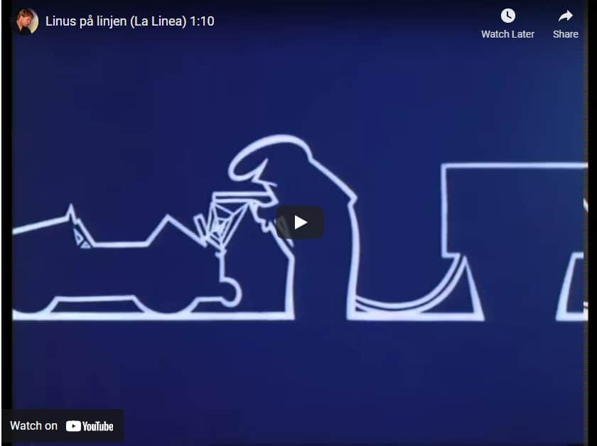
A little, simple animation, called Linus. This little character would interact with the world, morph into shapes and express a gamut of emotions as he responded to infuriating intrusions and delightful discoveries. I’ve since learned that he was Italian, called La Linea, syndicated in 50 countries worldwide. And he taught me a powerful and lifelong lesson about visual communication strategy.
As a child growing up in 1970s Sweden, my brother and I didn’t get the 24-hour dedicated children’s channels that we have today. So for me, it was incredibly exciting to watch this brief skit before bedtime. I didn’t know it at the time, but my lifelong love of design was fostered in those early years of enjoying 1970s animation.
Linus inspires my work now — using visual communication strategy to bring campaigns to life
A high-impact visual communication strategy with a storytelling approach brings the brand identity and the campaign messaging to life.
Because my creative background comes from journalism, rather than an artistic focus, I approach PR design from a storytelling perspective. Many clients operate in the B2B space and mostly, the message is more important than the creative. I believe the design can strengthen the impact and message penetration of a brand campaign, while also adhering to existing brand design parameters.
It’s not about rebranding companies – it’s about adhering to the existing and extensive brand identity and guidelines. High-impact visual communication strategy brings those elements to life. By understanding the messaging of the campaign and the target audiences, our design team supports the visual principles. In other words, we make sure the message really gets across.
Linus reminds us of the power of simplicity
Linus was a very basic line drawing, with simple animation. But he was able to convey emotion, and therefore, elicit a reaction in the audience. Brands can do the same if they take a simple approach.
Like any other language, misunderstandings arise if the visual communications aren’t understood by the intended audience. The mistake I see brands making is cramming in too much information and failing to integrate design into a message. Living in Singapore, I see campaigns that are packed with unnecessary additional messages and accompanied by a poorly chosen stock illustration or photo.
Unfortunately, because the message is convoluted and the design doesn’t amplify the content, consumers aren’t likely to gain awareness and a large budget is essentially wasted. This is particularly disappointing for public health campaigns. The design has about three seconds to catch the eye before the bus passes the billboard or the user scrolls by on Instagram.
Wanting to put in more information comes from enthusiasm, but unfortunately, those extras dilute the essential information. Cramming in logos, text, and calls to action means the design is cramped. Consequently, the main, singular message of the creative is lost. Understanding the way that people see things, how the eye moves and how to capture attention is a vital part of good PR design.
Taking inspiration from leading brand designs
Look at Chanel, Apple, Airbnb or many other world-leading brands. Their designs are often simple, elegant and consistent. By specifying and adhering to a constrained approach, the design supports the message, rather than overwhelms it.
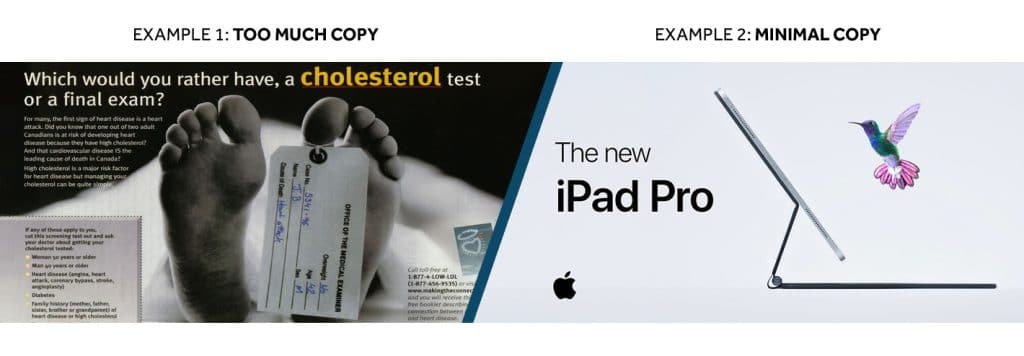
Currently, design trends are veering towards simplicity. It’s not about blindly following fashion, of course. However, brands can give an instant impression of being out of date if they choose cluttered creative. A few years ago a brush script font was very popular. As it gained traction, it peaked and became overexposed. Now, it’s now waning in popularity and seems dated.
Again, we can look to leading brands to see how they are simplifying everything for maximum impact.
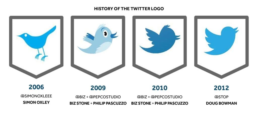
Look at how the twitter logo has evolved over the years, moving from a detailed bird cartoon to a simple and elegant silhouette. Apple, too, has removed the colour and bevelled effects from its logo

Design is communication and understanding is key
If we don’t deeply connect with our client’s brand, we are likely to start applying styles that aren’t a part of their visual language. As a design lead, I need to be vigilant, in order to quickly comprehend extensive brand guidelines for more than twenty lending brands in the Asia Pacific region.
Good visual communication strategy means that we ask questions to determine the desired outcome. For example, a client may ask for an infographic to support a public health campaign. Of course, my team can simply produce the desired infographic. But if I dig a little deeper I can better understand the objectives of the campaign and perhaps provide a better solution. I’ll ask myself, ‘Is this medium the best way to convey the message?’ Perhaps a social media animation or physical printed brochure would be more effective? In this way, we are more likely to deliver a more powerful design solution for our clients and deliver more return on investment.
Integrating design into PR campaigns from the onset is ideal. Because we’re an in-house team, we have the luxury of working with clients at the early stages of campaigns, so we have more access to the strategy, research and planning stages that informs the design at implementation stage. Having access to insights helps us understand the touchpoints in the customer acquisition journey and create cohesive designs that support and inform that process.
The best visual communication strategy is flexible and adaptable
It’s important that any design can be easily repurposed. We strive to deliver creative that can be adaptable down the track, maximising the client’s investment. Regardless of how the design starts, it should always be able to scale up — to the size of a billboard or event signage. The format needs to be of suitable resolution to allow the client to use it without having the cost of redoing the artwork. Whenever we create design, we think about how it can be rolled out to different platforms. Can this social media post become a printed flyer? Does the event invitation integrate with the signage and flyers? Having that cohesive, flexible approach at the onset extends the life of designs and creates a more powerful impact for the audience.
Linus isn’t around anymore, but his legacy lingers
I moved on from Linus, but my curiosity about design never waned. As I grew my career, I continued studying design in all its forms. I pored over Design Week magazine for decades, studying how brands approached concepts and learning how designs can convey emotions and persuade people to make connections with a brand. I do believe design is communication in its purest form.
Nowadays, there’s a smorgasbord of design inspiration everywhere. As a Scandinavian, I’m enjoying the current taste for clean, simple lines, clean white pages and modern yet simple typefaces. There’s a reason Helvetica and Futura are the go-to fonts for so many brands at present. The clean simple lines are classic and timeless. The simplicity of the designs let the campaign message shine, allowing the eye to comfortably absorb the message. It’s a pleasure to help my clients amplify the impact of their brands with high-value designs.
Sandpiper offers a full suite of design services including video production, animation, artwork, event design, social media content and printed materials. Contact us to learn more about our integrated PR design services.
You may also like:
